Ghermar&Sons
Legacy B2B websites often drown in bloat. The challenge was to architect a single-page experience that conveyed decades of global trade authority instantly, without sacrificing load speed or distracting the user from the primary conversion goal.

Ghermar & Sons needed a digital presence that matched their global scale. This high-performance landing page bridges the gap between modern design aesthetics and B2B conversion optimization. By improving the user journey and website navigation and highlighting core trust signals, the site transforms casual visitors into qualified international inquiries.
Approach
-
01
Market Intelligence
Audited top-tier global supply chain competitors to identify trust gaps and UX opportunities. -
02
Information Architecture
Designed a smooth, single-page flow built specifically for high-intent B2B buyers. -
03
UI/UX Engineering
Developed a timeless visual identity using brand colors to guide eye movement toward primary conversion points. -
04
Performance Optimization
Implemented pure vanilla JavaScript animations and CSS transitions to guarantee fast load times. -
05
Conversion Tracking
Deployed custom event tracking to measure engagement and iterate on lead quality post-launch.
Gallery
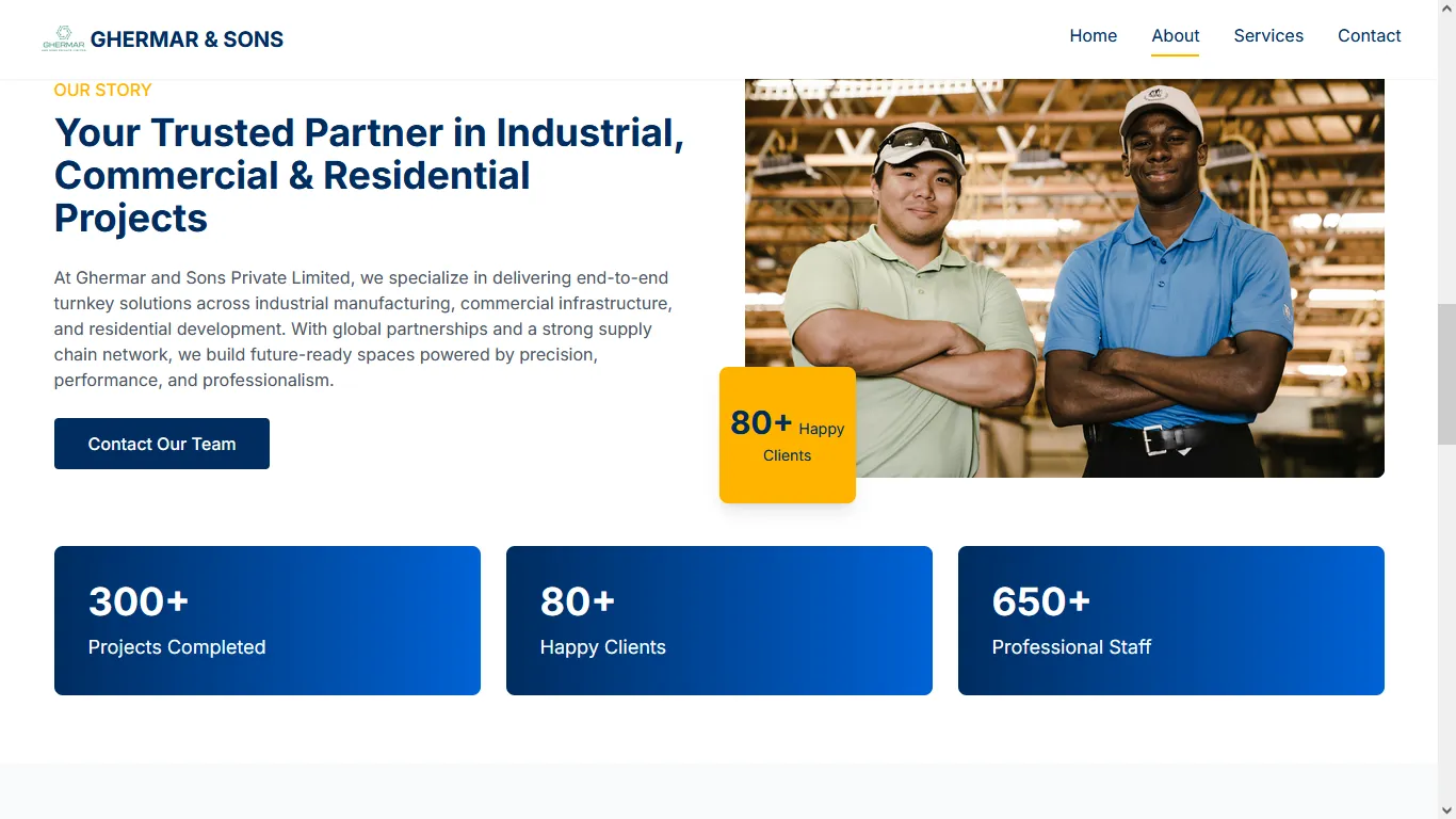

Lay stripped away all the bloat and delivered a site that loads instantly. Our inbound B2B inquiries noticeably increased within a month of launch.
Project Decisions
Trade-offs, challenges, and insights from the development process.
Legacy B2B websites often drown in bloat. The challenge was to architect a single-page experience that conveyed decades of global trade authority instantly, without sacrificing load speed or distracting the user from the primary conversion goal.
I adopted a minimalist web design approach, stripping away all non-essential elements. I used the brand's logo color palette with a single accent color to guide the user's eye. The typography is bold and expressive, acting as a primary design element. I implemented smooth scroll-triggered animations using vanilla JavaScript and CSS transitions to create an engaging user experience without compromising performance.
This project reinforced the importance of minimalism in B2B websites. Sometimes, less really is more. The focus on performance and mobile experience paid off significantly in user engagement metrics.
Outcomes Recap
After launchLet's build the next one together.
I take on one project at a time. Tell me what you're working on — I reply within a day.